-
01
柱状图
由条形高度差表示数值的统计图
 题目
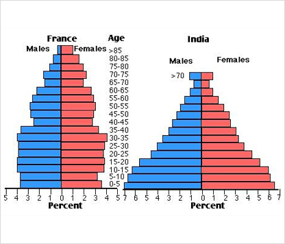
题目The charts below compare the age structure of the populations of France and India in 1984.
范文The two charts compare the populations of France and India in terms of age distribution by gender in the year 1984.
It is clear that the population of India was younger than that of France in 1984, with a noticeably larger proportion of people aged under 20. France, on the other hand, had a significantly larger percentage of elderly inhabitants.
In India, close to 14% of people were aged 5 or under, and each five-year age bracket above this contained an increasingly smaller proportion of the population. France's population, by contrast, was more evenly distributed across the age ranges, with similar figures (around 7% to 8% of all people) for each five-year cohort between the ages of 0 and 40. Somewhere between 10% and 15% of all French people were aged 70 or older, but the equivalent figure for India was only 2%.
Looking more closely at gender, there was a noticeably higher proportion of Frenchwomen than men in every cohort from age 50 upwards. For example, almost 3% of French 70- to 75-year-olds were women, while just under 2% were men. No significant gender differences can be seen on the Indian population chart.
【图形解析】
・20岁以下印度人口比例高于法国,说明整体上印度人口比法国年轻
・性别上,50岁以上法国女性显著比法国男性比例高,而印度人口在男女比例上无显著差异【范文解析】
・先介绍两个国家整体上最明显的对比【范文解析】
・详细分析两个国家差别最明显的年龄群体并以详实的数据进行描述【范文解析】
・最后不忘从性别角度去分析人口比例的差距
・图表中信息已经全部展现,无须结尾 -
02
饼图
由扇形表示数值的的统计图
 题目
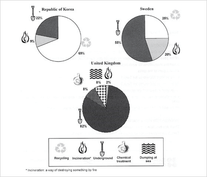
题目The pie charts below show how dangerous waste products are dealt with in three countries.
范文The charts compare Korea, Sweden and the UK in terms of the methods used in each country to dispose of harmful waste.
It is clear that in both the UK and Sweden, the majority of dangerous waste products are buried underground. By contrast, most hazardous materials in the Republic of Korea are recycled.
Looking at the information in more detail, we can see that 82% of the UK's dangerous waste is put into landfill sites. This disposal technique is used for 55% of the harmful waste in Sweden and only 22% of similar waste in Korea. The latter country recycles 69% of hazardous materials, which is far more than the other two nations.
While 25% of Sweden's dangerous waste is recycled, the UK does not recycle at all. Instead, it dumps waste at sea or treats it chemically. These two methods are not employed in Korea or Sweden, which favour incineration for 9% and 20% of dangerous waste respectively.
【图形解析】
・3个国家垃圾填埋的比例差别较大
・韩国比其他2国的有害垃圾回收率高出2倍
・只有英国使用化学处理和海洋倾倒方式处理有害垃圾【范文解析】
・在列举饼图数据时,为了防止单调枯燥,通常运用排序的方式进行说明
・类似的表达还有“be leading, mostly, most等【范文解析】
・细节描述段落
・在前一段的Overview基础上,发掘1个饼图中各区域间的百分比差异进行比较说明 -
03
线图
用折线表示数值走向的图表
 题目
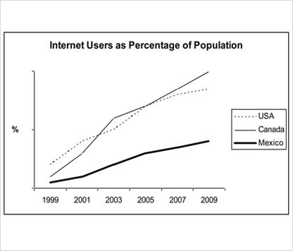
题目The line graph compares the percentage of people in three countries who used the internet between 1999 and 2009.
范文The line graph compares the percentage of people in three countries who used the Internet between 1999 and 2009.
It is clear that the proportion of the population who used the Internet increased in each country over the period shown. Overall, a much larger percentage of Canadians and Americans had access to the Internet in comparison with Mexicans, and Canada experienced the fastest growth in Internet usage.
In 1999, the proportion of people using the Internet in the USA was about 20%.The figures for Canada and Mexico were lower, at about 10% and 5% respectively. In 2005, Internet usage in both the USA and Canada rose to around 70% of the population, while the figure for Mexico reached just over 25%.
By 2009, the percentage of Internet users was highest in Canada. Almost 100% of Canadians used the Internet, compared to about 80% of Americans and only 40% of Mexicans.
【图形解析】
・3个国家自1999年开始使用人都为上升趋势
・墨西哥使用率低于其余2个国家
・美加2国增长率差别不大,加拿大使用率在2009年接近100%,为3国中最高的【范文解析】
・在第2段写overview,通常写2句
・不必在overview中包含具体数字【范文解析】
・细节描述段落
・按横轴时间顺序对3国同一数据的不同变化进行描述【范文解析】
・在细节描述段落中使用具体数值进行对比 -
04
表格
用列表进行横纵向比较的图表
 题目
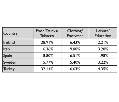
题目The table below gives information on consumer spending on different items in five different countries in 2002.
范文The table shows percentages of consumer expenditure for three categories of products and services in five countries in 2002.
It is clear that the largest proportion of consumer spending in each country went on food, drinks and tobacco. On the other hand, the leisure/education category has the lowest percentages in the table.
Out of the five countries, consumer spending on food, drinks and tobacco was noticeably higher in Turkey, at 32.14%, and Ireland, at nearly 29%. The proportion of spending on leisure and education was also highest in Turkey, at 4.35%, while expenditure on clothing and footwear was significantly higher in Italy, at 9%, than in any of the other countries.
It can be seen that Sweden had the lowest percentages of national consumer expenditure for food/drinks/tobacco and for clothing/footwear, at nearly 16% and just over 5% respectively. Spain had slightly higher figures for these categories, but the lowest figure for leisure/education, at only 1.98%.
【图形解析】
・3个国家自1999年开始使用人都为上升趋势
・墨西哥使用率低于其余2个国家
・美加2国增长率差别不大,加拿大使用率在2009年接近100%,为3国中最高的【范文解析】
・在第2段写overview,通常写2句
・不必在overview中包含具体数字【范文解析】
・细节描述段落
・竖向比较同一品类在不同国家的消费差异,找到最值进行描述【范文解析】
・细节描述段落
・横向比较同一国家不同品类的消费差异,找到最值进行描述 -
05
混合图
由两种以上图形组成的图表
攻破方法
- ・拿到考题以后,快速浏览题目中的文字信息
- ・其次,看文字说明,包括标题、标注和单位,弄懂数据所代表的信息
- ・整理写作思路,总数、平均数、对比数据放开头结尾剩余的数据,按图中顺序横向或竖向写
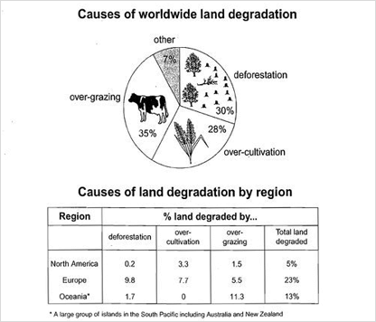
题目The pie chart below shows the main reasons why agricultural land becomes lessproductive. The table shows how these causes affected three regions of the world during the 1990s.
范文The pie chart shows that there are four main causes of farmland becoming degraded in the world today.
Globally, 65% of degradation is caused by too much animal grazing and tree clearance, constituting 35% and 30% respectively. A further 28% global degradation is due to over-cultivation of crops. Other causes account for only 7% collectively.
These causes affected different regions differently in the 1990,with Europe having as much as 9.8% degradation due to deforestation, while the impact of this Oceania and North America was minimal, with only 1.7% and 0.2% of land affected respectively.
Europe, with highest overall percentage of land degraded (23%), also suffered from over-cultivation (7.7%) and over-grazing (5.5%). In contrast, Oceania had 13% of degraded farmland and this was mainly due to over-grazing (11.3%).north America had a lower proportion of degraded land at only 5%, and the main causes of this were over-cultivation (3.3%) and, to a lesser extent, over-grazing (1.5%).
Overall, it is clear that Europe suffered more from farmland degradation than the other regions, and the main causes there were deforestation and over-cultivation.
【图形解析】
・整体趋势food/drinks/tobacco类别占比最高,leisure/education占比最低
・墨西哥使用率低于其余2个国家
・Turkey在food/drinks/tobacco和education/leisure类别比例都是最高的【范文解析】
・在第2段写第1张图,每段只描述1张图
・把图当成单独1张图来写,注意句型和词组的多样化【范文解析】
・在第3段写第2张图,每段只描述1张图
・写第2张图时注意写一句与上张图的连接句【范文解析】
・把图当成单独1张图来写
・纵向和总述土地破坏的描述和差异【范文解析】
・最后一段进行overview -
06
流程图
介绍制作步骤的图表
攻破方法
- ・主要用一般现在时
- ・经常使用被动语态,显得比较客观和正式
- ・找出流程图的始末点,并划分中间的步骤或阶段
- ・掌握表示“顺序”的连接词(Sequencing Words),用来说明过程的各个步骤和先后顺序
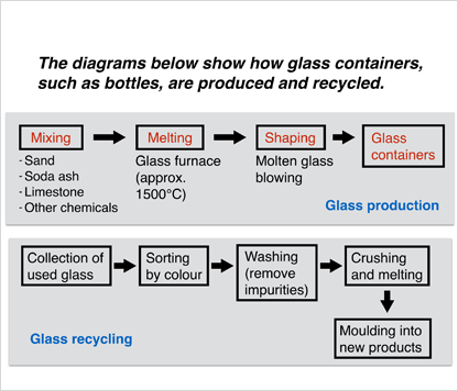
题目The diagrams below show how glass containers,such as bottles,are produced and recycled.
范文The diagrams illustrate the processes of how to produce and recyle glass containers. It is clear from the diagrams that there are three stages in the process of making glass containers. Meanwhile, four steps are required to recycle glass.
At the first stage of producing glass containers, sand is mixed with soda ash, limestone and other chemicals. This mixture is then brought and is melt in glass furnace where it is heated in high temperature which is approximately 1500˚C . The process continues with shaping the molten glass blowing, and then glass containers are produced at the final stage.
The first step of recycling glass is collecting the used glass. This collection is then sorted by colourbefore washing to remove impurities. The next steps of the cycling process, the sorted materials are crushed and melted. At the final step, these materials come to the moulding stage where they become final new products.
【图形解析】
・总共2个流程,玻璃制品的制造流程和再利用流程
・步骤方框下为解释补充性说明【范文解析】
・在第2段写第1张图,每段只描述1张图
・把图当成单独1张图来写,注意句型和词组的多样化【范文解析】
・第1段写overview,明确概括图中步骤数量
・使用定语从句,使行文美观易懂【范文解析】
・全篇使用顺序连接词,使文脉清晰,步骤先后顺序明确
・1个段落只写1个流程 -
07
地图
表示地理位置的图表
 题目
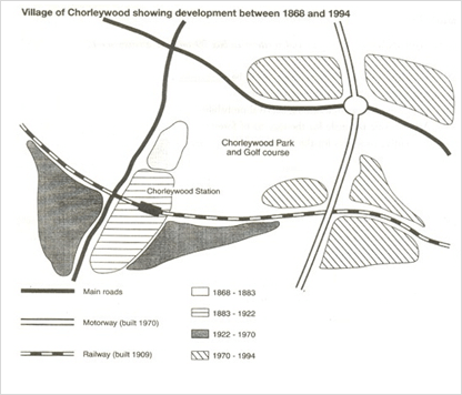
题目The map shows the village of Chorleywood showing development between 1868 and 1994.
范文The map shows the growth of a village called Chorleywood between 1868 and 1994.
It is clear that the village grew as the transport infrastructure was improved. Four periods of development are shown on the map, and each of the populated areas is near to the main roads, the railway or the motorway.
From 1868 to 1883, Chorleywood covered a small area next to one of the main roads. Chorleywood Park and Golf Course is now located next to this original village area. The village grew along the main road to the south between 1883 and 1922, and in 1909 a railway line was built crossing this area from west to east. Chorleywood station is in this part of the village.
The expansion of Chorleywood continued to the east and west alongside the railway line until 1970. At that time, a motorway was built to the east of the village, and from 1970 to 1994, further development of the village took place around motorway intersections with the railway and one of the main roads.
【图形解析】
・四个不同的时期,村庄交通设施有明显改善【范文解析】
・总写126年间最大的变化趋势
・先写结论再叙述理由的倒金字塔形式让行文脉络清晰,重点突出【范文解析】
・多使用表方位词语,如next to,使语言具象化有条理
・分时间段进行地址变迁的描述

